Apla Mandal
One app for a 31-year-old Ganeshotsav
Neighbours pay vargani, check tonight's aarti and relive the photos. Organisers keep every contribution on record. Four tabs, in English and Marathi.
Overview
A festival run by neighbours
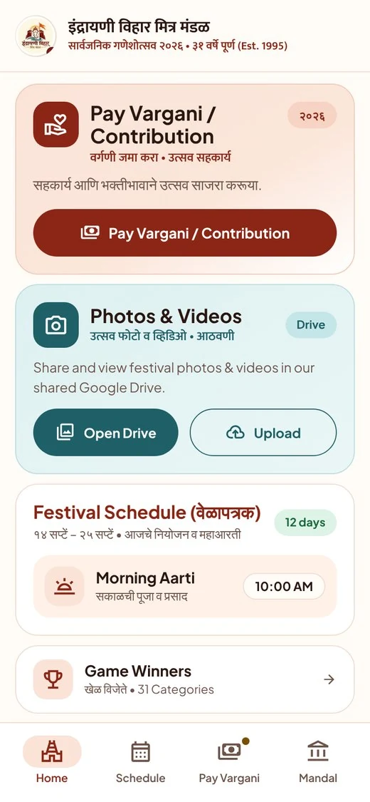
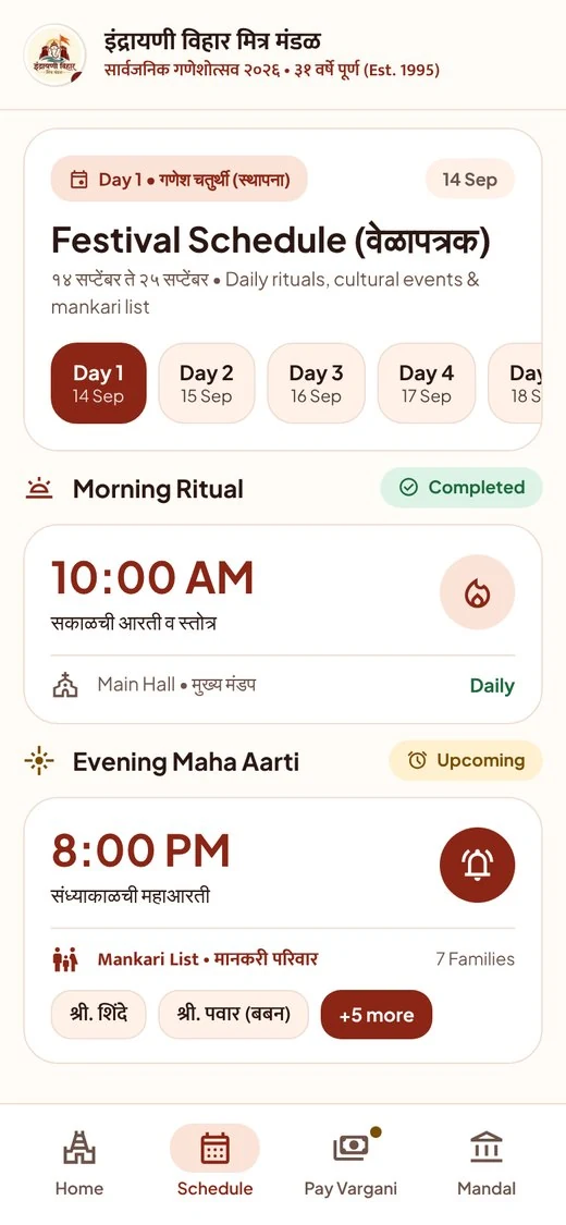
Indrayani Vihar Mitra Mandal in Lohegaon, Pune was founded in 1995. Its Ganeshotsav runs for twelve days, from 14 to 25 September in 2026, with daily aartis, cultural events and a list of mankari families.
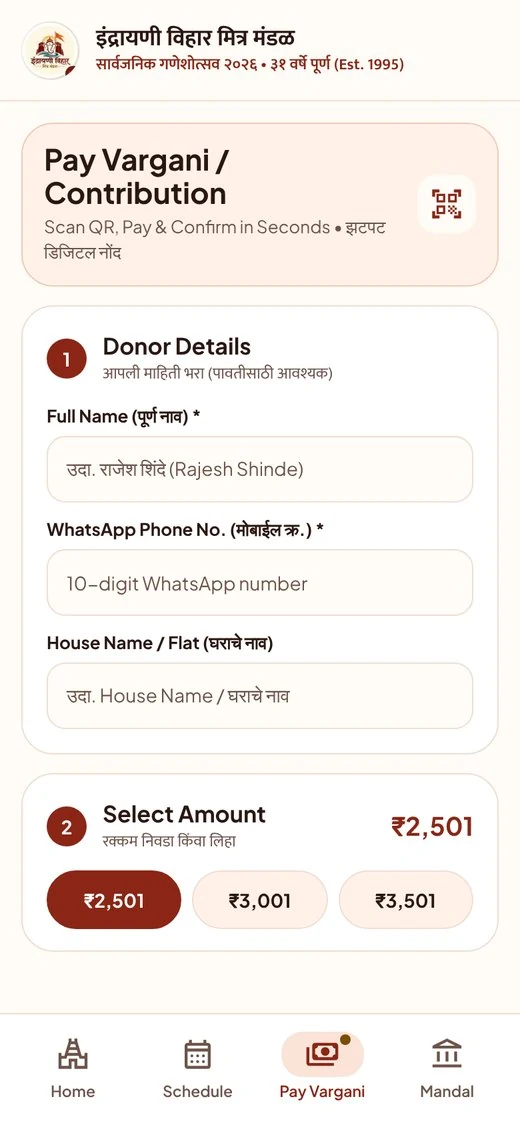
I designed and built the app for my own mandal: a home screen, a bilingual schedule, a four-step vargani flow and a PIN-protected organiser side. I then refreshed the interface into a lighter, clearer look.
Challenge
Everyone needs something different at night
Children, parents and elders all open the same app. Some need the aarti time in large type. Some need to pay and know it was noted. Organisers need a name, an amount and a receiver for every entry.
The brief I set myself: let any neighbour pay vargani and find the aarti time in under a minute, in the language they read best.
Approach
Familiar patterns, plain words
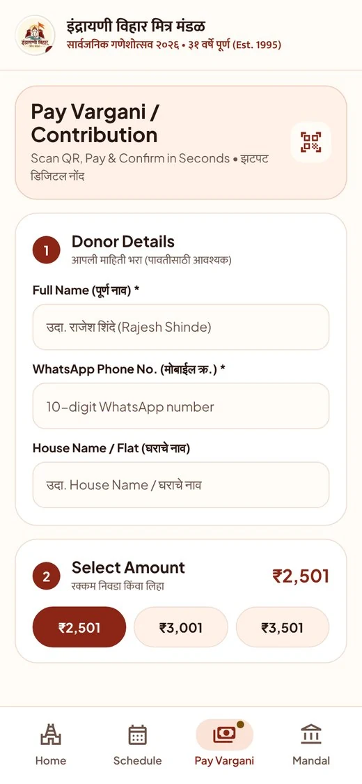
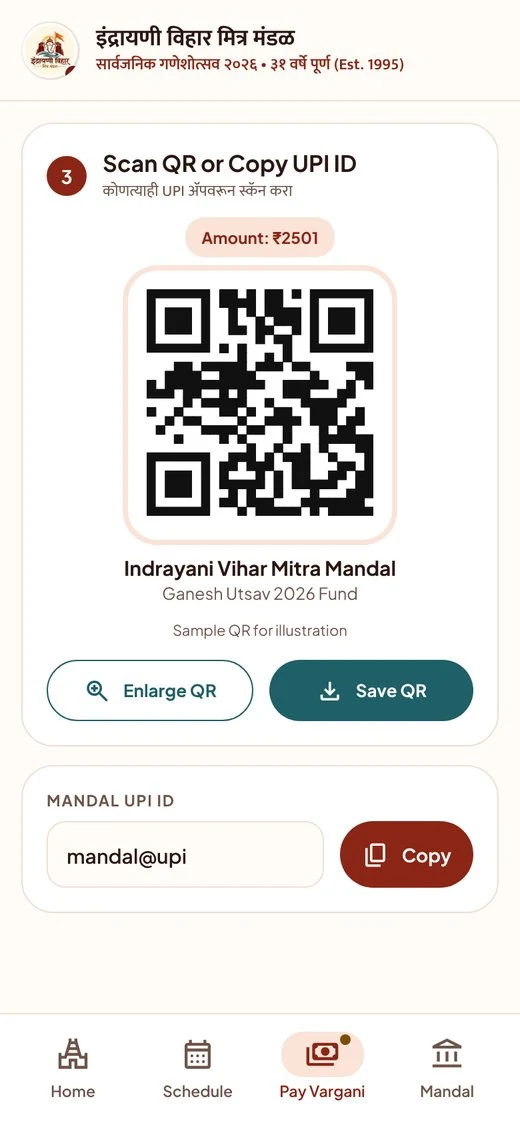
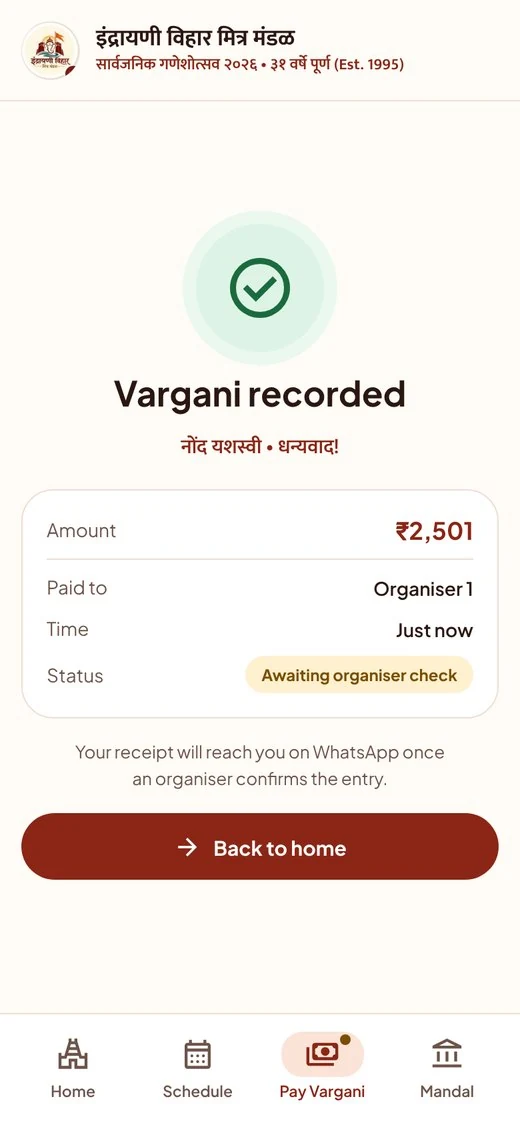
Audit
What I fixed after testing the live app myself
I opened every tab at phone width, measured tap targets and checked each label against the schedule. Three findings changed the design.
Touch targets
Call and chat buttons were 32px. They are now 44px.
Day count
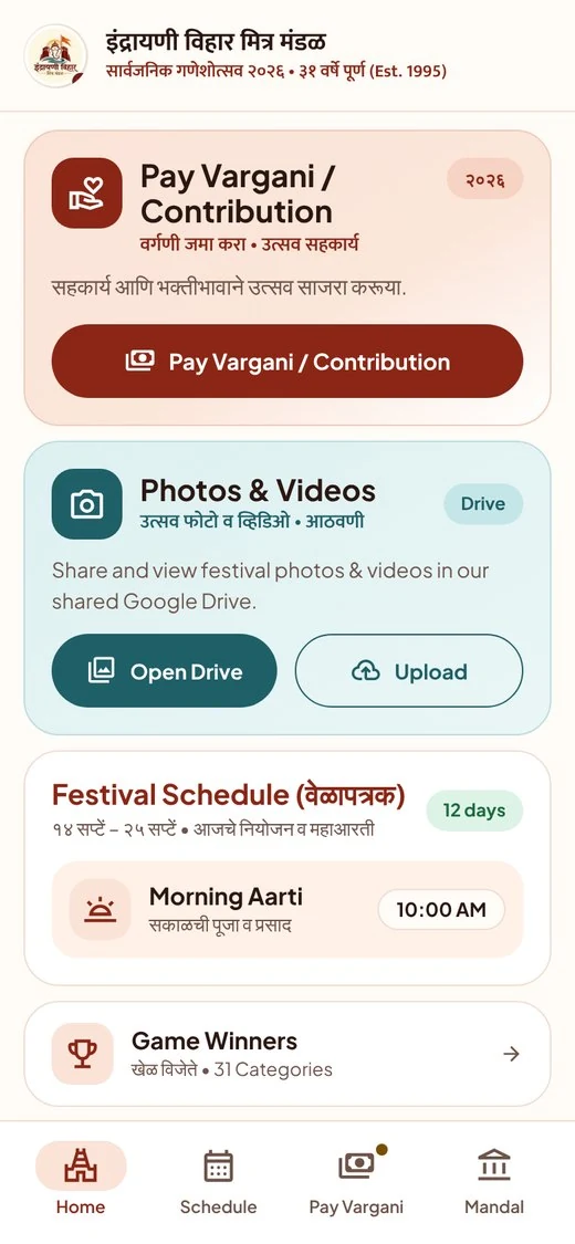
The header said 11 days beside 12 day chips. It now says 12.
Colour contrast
The maroon is deepened so text on cream clears 8 to 1.
Outcome
Live, audited, ready to test
The app served the 2026 festival. The light redesign is drawn and checked for contrast, and its test plan has pass marks set in advance. Usability tests with residents and volunteers are the next step, so I make no result claims yet.
Case study